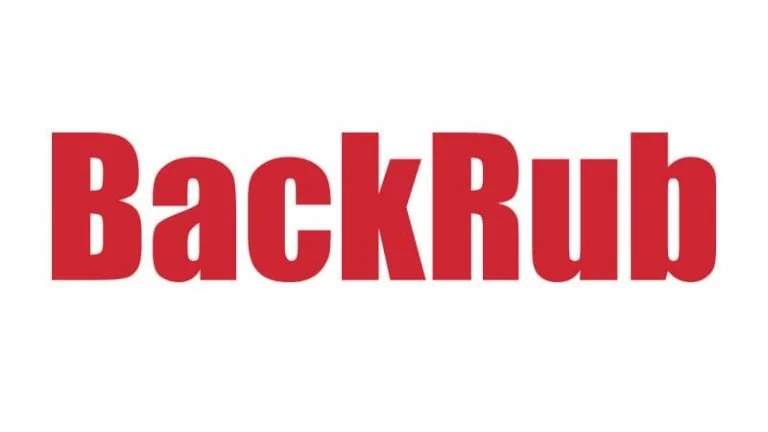
Google needs no introduction. Yet, I will say a few things about Google, without which an article on the Google logo will make no sense. Google was formed by two Stanford University students, viz. Sergey Brin and Larry Page. In 1995, Google was BackRub. In 1997, fortunately, the company discarded its hideous name and started calling itself Google.
Google is synonymous with its logo design. When you think about Google, you cannot think of anything without the logo. Other than in the BackRub days, the Google logo has been pretty much the same. The simplicity of the design is what makes the logo stand out. The name Google was derived from the word “Googol,” which means ten raised to the power of a hundred (10100).
In this article, I will focus on the history of the Google logo rather than the history of the company itself. I will talk about the evolution of Google’s logo, the ideas behind it, and the meanings that are encrypted in it. From its initial red BackRub logo to today’s Google logo, you will be taken through the whole journey.
In This Article
History And Evolution of The Google Logo
In 1995, Larry and Sergey called their creation BackRub as the chief function of the web crawler was to search through the backlinks of the internet.
After two years, they came up with a better idea and named the search engine Google, a misspelling of the term Googol. It was because Google was designed to provide users with a large number of results for each query they made.
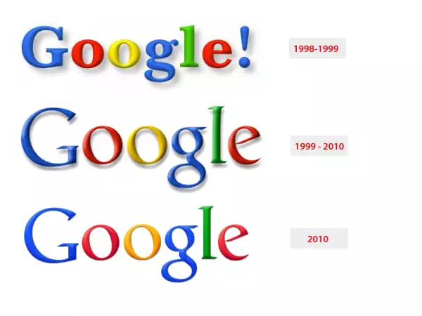
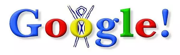
In 1998, the Google logo became more refined. Some say that the first Goole logo was created by Larry Page, and some say that Sergey Brin designed it on a free image editor called GIMP. I have not gone into the truth hunt, as there is no point. The logo wasn’t one to be proud of yet. It had an exclamation mark that was added as ‘Yahoo!’ had one as well.
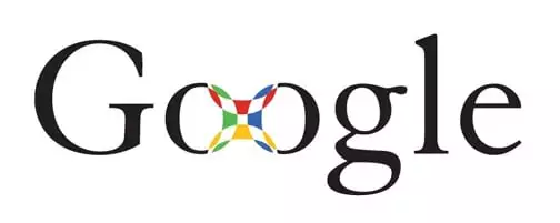
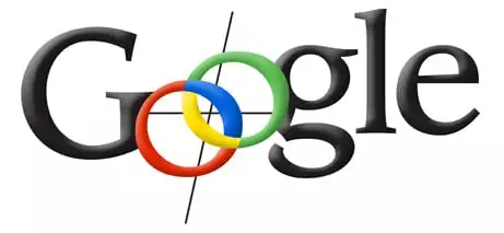
In 1999, Brin and Page were introduced to Ruth Kedar (Stanford Assistant Professor) by a mutual friend. Ruth was a Graphic Designer, and after being asked to design a few prototypes, she started with a black logo with a red-green-yellow-blue mark connecting the two ‘o’s. The Google creators liked the logo because the mark looked like a Chinese finger trap.
Ruth came up with a dozen of ideas in the course of making the prototypes that eventually contributed to the idea behind the Google logo as we see it today.
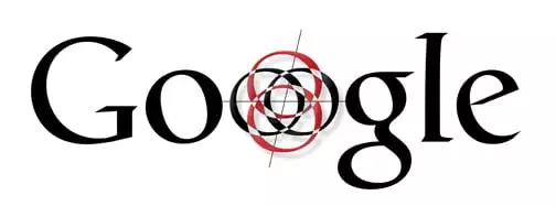
After the Chinese finger trap design, the designer tried a Catill typeface. This logo signified accuracy, and the second ‘o’ looked like a target.
At this moment, Ruth Kedar was getting playful. She tried interlocking the ‘o’s. The ‘o’s we see today at the bottom of each search engine results page are based on the ‘o’s Kedar designed.
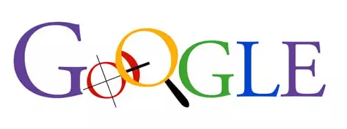
The next design Ruth came up with features a crosshair and a magnifying glass, which looked a bit too overwhelming to Brin and Page.
The subsequent iterations of Ruth’s designs started looking more like the Google logo we know today. The designs became more and more simplistic and youthful.
In the next design, Kedar added shadow and thicker lines to make the logo pop out.
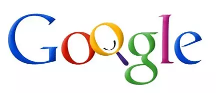
The eighth design she came up with was the simplest of all. She omitted the magnifying glass to broaden the idea about the brand’s potential. It was more than a search engine. To emphasize how untraditional Google is, she also changed the primary colors.
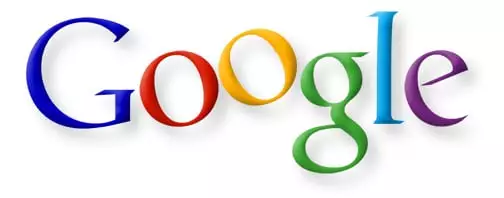
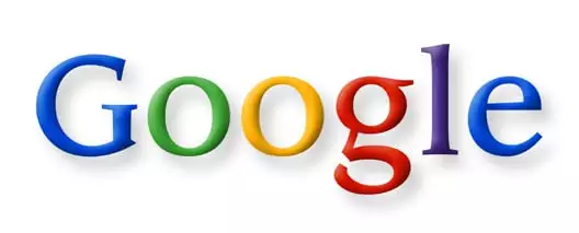
In her final design, Ruth made the Google logo even simpler by changing the slanted angling of the ‘o’s to a straight one. This became the official logo of Google from 1999 to 2010.
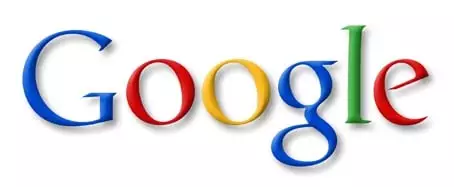
It was the 6th of May in 2010 when Google made two more changes to its logo. It changed the second ‘o’ from yellow to an orange color. It also removed the drop shadow.
In 2015, Google’s designers met for a week-long design brainstorming to produce a new logo for the biggest search engine in the world. After this design sprint, the Google logo changed dramatically. The colors remained the same, but the typeface changed from Catull to a custom Product Sans.
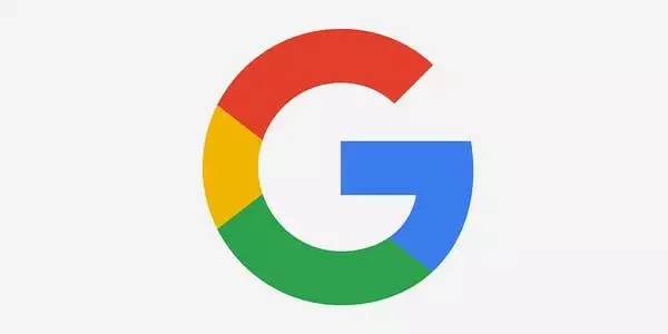
After this brainstorming, Google also came up with a number of logo variations, including the rainbow ‘G’ we see almost every day now. Currently, it represents the smartphone app. Google also introduced a favicon for Google websites and a microphone for voice searches.
Although the new logo is simple, the change isn’t. The older logo used a typeface that has serifs which made it less versatile than the new one, which uses a schoolbook-inspired Product Sans. This is because the weight of the letters varies in a serif typeface.
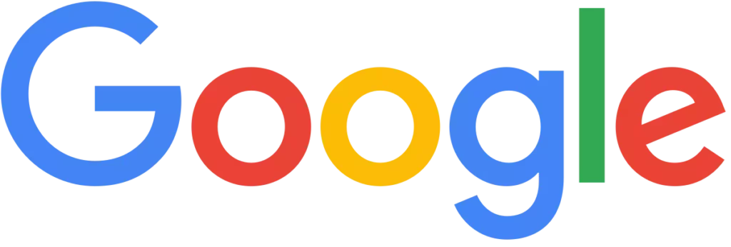
Since Product Sans is a sans-serif typeface, it is convenient for Google’s designers to manipulate the logo for different types and sizes. Google has a diverse product line, and it was essential for the company to change the logo typeface to one that can be easily adapted to different screens. Moreover, the new logo looks more fun, simpler, friendly, and welcoming.
The Google Logo is Dynamic
You must have noticed that there are dots that bounce when you start a voice search on your mobile device. When you speak, the dots transform into an equalizer that moves with your voice in sync. Once you stop speaking, the equalizer goes back to its dots form, and the dots ripple as Google searches for results.
According to a Google design team blog post, “A full range of expressions were developed, including listening, thinking, replying, incomprehension, and confirmation.” Everything that moves in the Google logo moves in a fixed and consistent path. The curves and arcs along which the letters and dots move are very pleasing to the eye while being extremely minimalistic.
Google Doodle & Its Growth
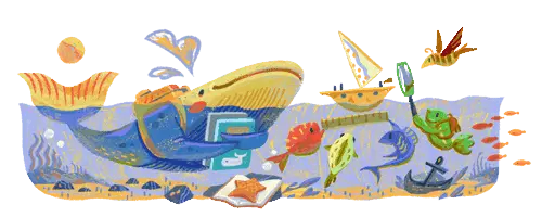
It will be a blunder if I don’t talk about the Google Doodle while writing about the Google logo. The first Google doodle was implemented in the year 1998. While Page and Sergey were attending the Burning Man festival, they put a stick figure drawing behind the second ‘o’ of the Google logo as an ‘out of office’ sign.
The detailing of Google Doodles developed drastically over the years. In 2000, Dennis Hwang, who was an intern back then, designed a doodle for Bastille Day. That doodle was so good that it got Hwang the position of “chief doodler.”
Google Doodles now are used to commemorate important events, special occasions, popular holidays, and birthdays of notable personalities, including scientists, musicians, thinkers, artists, etc. Google Doodles have become more and more global and creative over the course of time.
The decision of which days and events to feature in the Google Doodles is taken by a Google team. The team periodically brainstorms for the ideation. Also, the doodle ideas sometimes come from users too. After an idea gets approval, the actual work of designing the doodles is performed by illustrators and engineers.
According to a report by Google in 2015, they have released more than 2000 doodles. And till today, Google has crossed 5000 doodles.
The users are invited by Google for doodle ideas they can send to Google at [email protected]. You can check out the Google Doodles Archive here.
Why is Google Logo Grey Today?
If you had noticed that in September, the Google logo went grey. This was done by Google as a tribute to the late Queen of Britain, Queen Elizabeth II. It was a mark of respect. Google wanted to pay condolences for the passing of the Queen.
There is a Message Behind The 4 Colors of The Google Logo
Colors are used meticulously in logos to involve emotions. Google’s initial design from 1998 is what inspired all the subsequent developments in its logo. The main colors Google uses are blue, red, yellow, and green. And it is obvious that Google hasn’t chosen its colors randomly. After all, it is Google. There have to be reasons; there has to be a message or idea every color carries.
According to Ruth Kedar, the initial designer of the Google logo, the idea was to incorporate three primary colors and a secondary color (blue). The secondary color was used on the letter ‘l’ to signify the rules-defying character of Google. The logo has both uniformity and disruption in its color scheme.
Let’s take a look at the meaning of each color in the Google logo.
Blue
Blue signifies trust and reliability. So, the blue color in Google’s logo represents the reliability of the company. This is the formal part of Google. Blue is used by many big companies like LinkedIn, Twitter, and Facebook to win users’ trust.
Red
Red is an aggressive color. It represents vigor, passion, and excitement. TRed in Google’s logo hence represents the company’s power to be attractive.
Yellow
Yellow in the Google logo stands for warmth and the happy side of the company. Yellow also signifies cheerfulness, energy, and creativity.
Green
Green is the color of nature and hence it signifies harmony and growth. Green is also used by companies to shed light on its eco-friendly side.
The combination of these four colors is undoubtedly pleasing to look at. Red, Blue, and Yellow are the primary colors in paint, and Red, Blue, and Green are the primary colors of light. They are meant to be harmonious in unison.
Also, the four colors red, green, yellow, and blue pay homage to the first server of Google. Google’s first server was built with lego in blue, red, yellow, and green colors.
All in all, in addition to being eye-catching and aesthetically pleasing, the Google logo is also extremely emotions-evoking. It makes you want to trust it and love it. It makes you feel fulfilled. And that is the marketing goal behind any good branding.
The Evolution of Google Logo [Video]
Wrapping Up
With such a fast-paced change in everything, it is most likely that the Google logo will change in a couple of years or less again. With the introduction of new devices, services, and technology, it is inevitable that designers would want to create logos that are more adaptive and versatile. And, simplicity and minimalism are your best bets when you want to be adaptive. Moreover, it is not just that technology alone evolves, people evolve too. And most probably we will see a new version of the Google logo sooner than we think.